I'm a passionate software engineer specializing in full-stack development, focused on building impactful products and delivering exceptional user experiences.
Recent Posts
View All
Configure Linux PC for Full-Stack Development
A comprehensive guide to setting up your Linux PC for full-stack development, including essential tools, configurations, and best practices.

Marrakech: A Day at Majorelle Gardens
Explore the vibrant Majorelle Gardens in Marrakech, a masterpiece of botanical art and design created by Jacques Majorelle and later restored by Yves Saint Laurent.
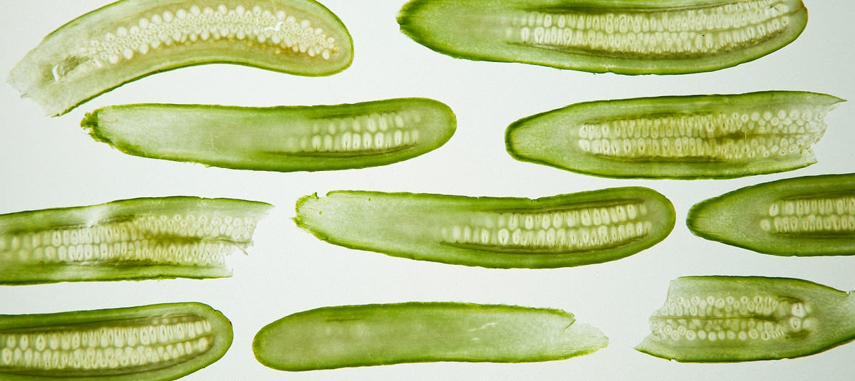
Pickle Inside Main: A Python Gotcha
Learn about a common Python gotcha when using pickle inside the main module, and how to properly structure your code to avoid multiprocessing issues.

Create Slides from Jupyter Notebooks
Learn how to transform your Jupyter Notebooks into beautiful presentations using RISE and reveal.js, perfect for data science talks and technical presentations.
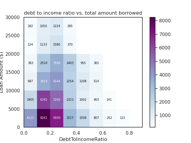
Bivariate Data Exploration with Matplotlib & Seaborn
Explore relationships between pairs of variables in your dataset using bivariate plots with Matplotlib and Seaborn. Learn about scatterplots, heatmaps, box plots, and more.

Univariate Data Exploration with Matplotlib & Seaborn
Learn how to explore single variables in your dataset using univariate plots with Matplotlib and Seaborn. Master histograms, bar charts, and more.